Here is our group’s final result on the music video
Tuesday, March 11, 2025
Critical Self Reflection
Here is my final Critical Self Reflection where I critically reflect on my project with my group.
Here is the link to my Critical Self Reflection
If that doesnt work, use this link: https://docs.google.com/document/d/1cAWn25pxipF7cBUhFCbWx6KNrX03zjucRP6JWDTY-PY/edit?usp=sharing
Monday, March 10, 2025
Research & Development: Social Media
Here is our team's research and development process and progress of the social media for our music video. I am going to explain everything about our social media in this page. This is also where we search other bands' social media for inspirations.

.png)


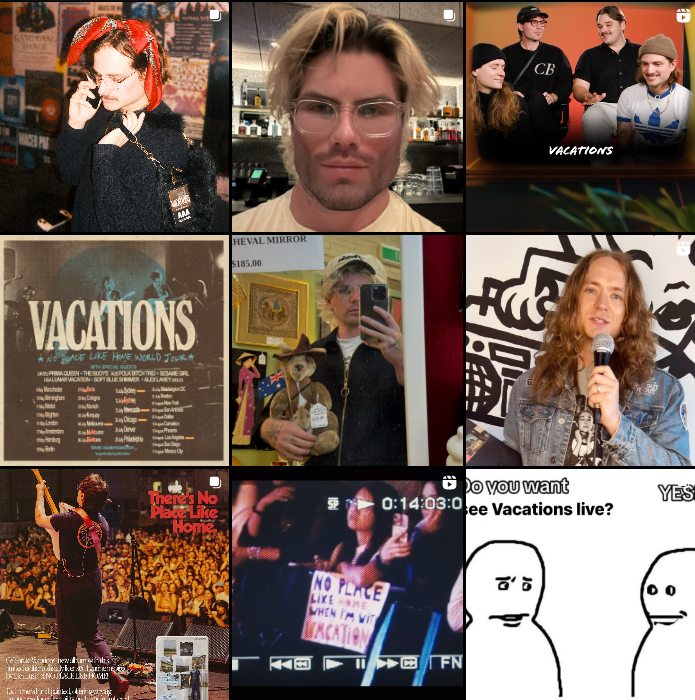
RESEARCH #1: VACATIONS
What do they post on their social media page? Can you group the different posts into categories (eg Personal, promotional etc)
Just like other bands, the Vacations share updates and activities for their fans to keep them informed about the band's current state, endeavors, and other aspects related to the band. What adds a personal touch to their account is their sharing of daily behind-the-scenes activities. They also frequently post memes that are mostly related about themselves, which adds a more relaxed and playful vibe to the band. This contributes to the development of their image as a fun and laid-back band on their social media pages, contrasting to their musical persona that they've shown in the music (composed). In addition to sharing personal insights, they also create promotional content, primarily focused on their tour schedules that include dates and locations for their concerts.
Does it feel personal or is someone else creating content for them?
Their social media profiles come across as more personal instead of being managed by a team or a corporate that filters the content of their post for the sake of their official accounts. It seems that their goal is to connect with the audience by presenting themselves as relatable, choosing to be seen as a humble, and fun band rather than as glamorous or formal superstars.
Do fans have the chance to interact and engage with a. The artist b. Other fans
Fans of VACATIONS is possible to interact with the artist (a) through the instagram comment sections, but it seems that the band choose did not make any interaction with the fans throughout their social pages. It seems that instagram acts as an update of what are they up to and an announcement of tours; basically, an update of their activity in general. But, fans can still interact with the other fans (b) through the comment sections, and it is most likely to discuss and share their thoughts about the band's posts.
How does the artist promote their music?
They promote their music/bands through their social media pages while posting memes to maintain a relaxed engagement of the band between their audiences. They're the most actives in Instagram and Tiktok, as they got the most engagement on those social media platform.
How has this soc media influenced you?
We would like to conform the meme posting contents that they did in their social media pages, as we want our band to be known the same way as them, which is a playful and easy-going persona that we show in social media. The reason why this is necessary is because we want.
RESEARCH #2: REALITY CLUBS
What do they post on their social media page? Can you group the different posts into categories (eg Personal, promotional etc)
On their social media platforms, they post updates about the band’s activities and share information regarding their current situation to keep their fans in the loop. Furthermore, they have recently uploaded mini-vlogs showcasing the city they are visiting for their latest concert series, known as the BUZZ Tour, which they refer to as "stage journal." They also seem to be promoting their merchandise through their social media channels. Overall, their social media posts are mostly well-polished and professionally edited.
Does it feel personal or is someone else creating content for them?
For Reality Clubs it looks like a team of social media sections and photographers are behind the band while developing, creating, and filtering contents that are allowed to be posted to the band's social media page.
Do fans have the chance to interact and engage with a. The artist b. Other fans
In the majority of their social media updates, there is no indication that the band replies to or engages with comments from their fans. The comments section is consistently filled with fans sharing their support and motivational messages for the band. When the post pertains to an upcoming concert, attendees express their enthusiasm about the band performing in their cities, which boosts engagement and excitement among fans. While they may not communicate on social media, they do connect with their audience during live performances.
How does the artist promote their music?
Reality Club promotes their music through social media, such as Instagrams as the main platform. Other than that, they also promote their music through live performances and world tours (e.g. BUZZ Tour) in order to increase the awareness for their new music amongst their loyal fans. Not only that, they feature they're new released on their social media bio.
How has this soc media influenced you?
The vibrant neon colors on some posts inspired us to assign a unique color theme to each member of our band. For example, the neon color associated with Louis would be red. When he is the spotlight/at least present in a post, ambiance of that post will closely reflect the color red as well. This color will be symbolising the personality of the respective member.
This is the social media we're aiming for:
However, this is our current draft:
Research & Development: Digipak
This is the blog post of where the research and development of our digipak is discussed.
In this blogpost, I will show our research of other bands' digipaks (inderock) and implement those effects that would make our digipak look like an indierock digipak.
Here are some digipak examples that our group and I had researched:

These Indie album covers seem to follow a convention of having grainy imagery of an abstract photo that may have meaning behind it, sometimes being poorly lit. Some album covers also feature duo-toned imagery. The typeface used for all of these covers seem to be sans serif typefaces. These are the visuals that I will attempt to replicate in order to conform to Indie album cover conventions.
Instead of putting all the sides of the digipak in one file, I decided that I'll do it in sections, front cover, back cover, spine, etc.

I will be using this template to create my digipak. And as you can see, the digipak is divided into four sections which are fron & back covers, and the insides is handy to work with.
This is our first draft of the digipak:


.png)

Sunday, March 9, 2025
Screen Test: Audience Feedback
This is the blog post where I will explain the results of our audience's review of Freaky Vro's (our band) social media page, album covers, and our music video. We had asked them questions on how our page can be relatable to them so that they can feel engaged as well.
The purpose and aim of a screen test is to receive audience feedback, and that audience feedback can be used to either improvise the quality of our social media, album covers, or music videos. With audience feedback, it would be easier for our group to target audience properly and to be more engaged with them as with audience feedback, they can voice out their opinion on something they think could be improved. We decided to use Google Form to ask our audience about things that they think needs improvements and how we can engage more with them.
Here are the Social Media Questions:
- Gender
- Age
- How often do you listen to the genre Indie/Indierock music?
- If you were a part of our band, what would you do to make our social page more engaging and interesting?
- If our social media page is engaging, tell us what makes us engaging to you? If not, give us an opinion on how we can improvise.
- What are the three words you can think of that describe the vibe/atmosphere of an Indie album? And does it match our's?
- How does our artist's persona relate to you?
We shaped this question to be more personalized to get the audience's positive et genuine opinions and by doing this, we hope to receive as many opinions in order for us to become an ideal image of an indie social media page according to what the audience expects us to be as an Indierock band. We asked about our demographics because that's a crucial part to acknowledge so that we're able to represent ourselves visualy through our social media page (instagram). Here are the drafts of our social media page which we showed the audience on the google form.


Here are the results from the audience feedback:

From the feedback we learned that our social media page should be a little bit more refined or make it a little more formal. Although we want to be known for the humble imagery and casual atmosphere, but we also not forgetting our status as an idol; an influencer who influenced a lot of people in the future.
We are going to change some pictures here, as this is our first draft maybe we can take out some pictures so that we have some "music or a band" vibes in this social page. And also, maybe we could make a tour poster which we hope will reinforce our group to be an actual band in our social media page; in other words, we don't want our social media page to heavily appear like some average personal-Instagram users posts.
This screen test was a useful part of our process because we can get testimonies from real life music enjoyer. From those testimonies, opinions, critics, and tips, we can improve and add something to our music video, social media, and digipak/album.
- Age
- Gender
- How often do you watch music videos?
- How can you relate with the protagonist?
- What words would you use to describe the emotions felt in the sample video?
- How good was the overall quality, writing & message of the music video?
- How well do you think the visuals matched the mood and message of the song? Please explain your thoughts.
- What do you think the story or message the sample video is trying to convey?
- What were your favorite parts of the sample video?
- How would you improve on the scenes in the sample video?
We chose these questions because we didn't want to take up our audience's time a lot and these questions seem to be the short enough to be answered in a little generous amount of time. We included members of our target demographic in the screen test to ensure that the feedback we receive is appropriate. Finding people for the screen test was somewhat easy, since we had a handful of friends that were inclined to pacrticipate in the small feedback form. Here is the draft that we showed the audience in the google form.
And here are the results from the feedback:

From the feedback we learned that our video is somewhat relatable with teenage 17 year old audiences and that they seem to grasp the story of the music video quite well. We also noticed that some aspects of the video are a little blurry
We are going to change some closeups to be less blurry by reshooting some scenes so that it can be clearer in the final outcome. We're also going to reshoot some performance scenes, as I feel they look a little bland and too stationary.
This screen test was a useful part of our process because it helps us grow towards are target audience and make us to create a proper artist with realistic aims and views. This also allows us to better connect with the target audience and make our product tick the right boxes to appeal to the target audience
Thursday, March 6, 2025
Monday, January 20, 2025
Branding Research
This blogpost will show you our branding research of Vacations which is the band that created the music we're using as a project.
Social Media

Up above this text are screenshots of Vacations' social media. We can see that their social media posts are more chill and vintage vibe as well as having their instagram page filled with memes, rather than their type of music whereas it has more of a sad vibe. We can see that their profile pictures on these three social media always have a complete group of their band.
The album covers have a very chill vibe and very simple photographs taken, except for the album "Vibes" where I'm guessing it's a drawing of leaves. These simple photographs on their album makes them good to look at because it gives the audience a very chill vibe. This conforms to their genre which indierock contents are usually low buget quality and sometimes random.
Here is our mindmap of the branding research:
.png)
REFLECTION: This mindmap helped us a lot. It showed a very clear detail about how indie bands branding should be. This is significant to our branding image, band identity, and it helps us on determining how our social media should look like.
Monday, January 13, 2025
Classwork: Multicam editing
In this blog you can find the work I did on how to edit with multiple cameras. My group filmed the footage, but I edited it alone. My teacher provided a template for the blog post.
What is Multicam Editing?
Multicam editing is the process of editing footage of a single scene or subject recorded from different cameras and angles. Showing the same scene or subject from different angles helps make the video more dynamic and visually captivating for your audience
Shooting
Our subject , a classmate, stood in the centre of the room and did a short performance. My group stood around the subject to record the performance from different angles. You can also see members from other groups because we did this lesson as a class. To make it easier to synchronise our cameras, the teacher clapped at the start of the scene. This allowed us to line up the video in the editing process and ensure that the transitions would be smooth. Without this simple action it would have taken a lot longer to sync the videos.
(BEHIND THE SCENES IMAGES): LINK HERE
Here are the raw videos from my group members:
1. Nathan
2. Ata
3. Haresha
4. Louis was the one acting*
My editing process
Upload the videos to the editing software (CapCut)
Detach the audio of the clip you wish to use in the final video.
Find the ‘clap’ marker on the audio.
Line up the video files together.
Cut where I want the edit to happen
Don’t delete the clip, just lower the opacity. This way it can be used again later.
Mute all clips except for the one you want to use.

Here is my final edited video:
Reflection:
At the beginning of the editing process, I had a little trouble because I was confused on what to do and how to make match-cuts since one of the video didnt start recording before the clap. Also, using a phone to edit with capcut is way different than using laptop. But after a while of trying to figure out how to match the videos' timing with my video, i started to pick up some momentum and quickly understand the key to match-cuts. I extracted the audio from my video, and then used the feature "add beats" to match the audio with the other clips which made it much easier for me to edit. I managed to finish editing right before the class ends.
Mini Project
MINI PROJECT: Music Video
This is my group's mini project. Our task here was to create a lipsyncing video for a specific part from a song called "Here Comes the Sun" by The Beatles
Before we continued our big music video project, our teacher, Mr.Nick, had given us a task. The task that was given is making a small video of us lipsyncing a song from The Beatle which is called Here Comes the Sun. We were given about a week to finish this mini project. The point of this mini project is to improve our lipsyncing skills for our big music video project.
Our teacher had some recommendations about the mini project, he said something about instead of lipsyncing it's better to actually sing the song. I get his point, because when we actually sing the song, our lips would have a much more accurate movement and improves the quality of our performance.
Post Production
This is the part where we do all the planning and storyboard which my group mates did (Nathan and Louis). After that, our teacher said we only had about 35 minutes to shoot the scenes, maybe more or less, which I'd say that was quite a small amount of time. Mr also said we can only shoot at the pre-school building (which is the building we are currently in) to avoide any distractions. So we started shooting..


Production
This is the part where we started recording our mini project, yippee. We recorded our scenes based off of our storyboard. Our location of production was in the pre-school canteen and it was raining quite heavily which kinda defeats the reason why this music was chosen for the mini project. The part where it goes "Little darling, I feel that ice is slowly melting" was our first scene to shoot. Also, the surroundings were quite loud because of the rain, but luckily Nathan brought his mini speaker which helped us a lot to sync our movement and to recognize the beat much clear.


On the second scene, the sun appeared just a little. We moved the another side of the canteen which was the stairs, not the one heading to the second floor. Thankfully, the sky got brighter which helped us a lot with our scene because it gave us an idea. It took us about 3 shots to finish right before the time ran out which was quicker than we expected it to be.

Post Production
Lastly, after we finished shooting the scenes, we went back up to our classroom to edit the videos, sync the music with the video. However, time wasn't on our side because we only had a little time to edit which was about 30 minutes?? Atleast that's what I remember. We divided tasks. Nathan and Louis were editing the video, Haresha and I did the blogpost as well as uploading behind the scenes documents.


Video Result
Video:
Reflection:
Honestly, I think our group did pretty well. Our chemistry was driven well. Even in situations that we didn't expect, our result wasn't disappointing. The way we communicate to each other was good as well as the way we divide tasks where Nathan and Louis did the shooting and acting, Haresha and I created the blogpost as well as taking documentations of behind the scenes. We only had a little time to create blogpost and edit the video, so we had to take it home and work on it over the weekends. Thankfully, we finished our mini project on time.
Subscribe to:
Comments (Atom)

-
 Here is our team's research and development process and progress of the social media for our music video. I am going to explain everythi...
 -
MINI PROJECT: Music Video This is my group's mini project. Our task here was to create a lipsyncing video for a specific part from a s...
