Labels

Showing posts with label Comp 1. Show all posts

Sunday, November 12, 2023

Article 1st Draft


Reflection:

(I had a tough time making this since I could hardly find an information source. So at this point, I only wrote what I know about him. Luckily, I have watched him since the beginning of his zx636. To make this even complete, I will try to interview him in an event to find further information)

The White Tiger

Keysa Mahesa’s Unique White R1M


KYS’ Journey

Keysa Mahesa is a 22 year old teenager from Bali who does content creation for living and has a youtube channel. Since he was a kid, his passion has always been riding a motorcycle. He started riding motorcycles when he was 17 and he owned a Kawasaki Z900 at that time. After a couple years, he started booming in youtube and became famous because of his motovlogging. After a while, he sold his Z900 and bought two motorcycles, the Kawasaki ZX636 and the CBR1000R, but after two months, he sold his CBR1000R. After uploading some more youtube videos and Instagram reels of his bike, he started getting fans around Bali. He loved his ZX636 so much that he named it “Keni”. After he got more money from youtube and content creation, he bought the 2020 Yamaha R1M and named it “Blacky” because of its body covered with carbon fiber. He then sold Keni to his friend for Rp300.000.000. 


Blacky’s Transformation

Blacky had its body mostly covered with black carbon fiber. Keysa thought the livery was too common to the other R1Ms so he decided to research for a new livery. After a while, he then created the white and blue livery, making it similar to his logo color. His R1M has a blue striping on the front, white painted carbon fiber winglet, blue LED lights on the bottom, blue striping on the fairing that says “KYS” which represents his name “Keysa Mahesa”. Other than being famous for his youtube channel, Keysa’s R1M took his instagram page to the whole world which makes him even more famous by appearing on people’s FYP.


His R1M transformation did not cost him a lot. Estimation of 4.000.000 IDR, with the winglet carbon fiber, wrapping, exhaust, and bottom LED lights on an R1M, automotive lovers does not think it was expensive at all. Compared to his friend Bima Nata who bought an R1M longer than Keysa did, Keysa’s bike is said to have a better look than Bima’s R1M, even if Bima’s bike is fully covered in carbon fiber. After changing his bike livery, he got more recognition around the world. It really made an effect on his audience due to his unique livery. The audience finds it really easy since his bike is different from the others. Who does not know what his bike looks like, right? From my experience, I have seen him at night very clearly. With his blue LED lights on the bottom, I can tell that he passed by me. 


Difference between the R1 & R1M

Have you ever wondered what are the differences between the Yamaha R1 and the R1M? Well, there are a lot of different features between them such as the Electronic Racing Suspension a.k.a. ERS system. The R1M has this feature where the suspension can be adjusted by the rider to seek comfort and experience better performance while riding. However, the normal R1 does not have this feature because it is made only for sport-touring. 


Another difference is clearly the body parts. Even though the design is the same, the material for the R1M is different from the normal R1 because it uses carbon fiber. The carbon fiber makes the R1M look special even with the same design. It also increases the performance of the R1M because carbon fiber is pretty light and strong for a motorcycle body part. The normal R1 does not use carbon fiber due to its cheap pricing and lack of race use. 


A Communication Control Unit or shortened as CCU is also one of the features that the R1M has but the normal R1 does not. A CCU can be used as a performance tracker, usually used when racing. The owner can download the data from the bike and keep track of the bike’s performance after it is used for racing and track environments. 


The pricing is one of the most obvious differences between these two bikes. The R1 only cost 605.000.000 IDR. However the R1M cost 812.000.000 IDR, a bit more expensive due to its useful features and carbon fiber. The R1M is also a little bit faster than the normal R1 which explains why it is more expensive. 


Lastly, the R1M is a limited production due to its high cost of production. This motorcycle is made for people who enjoy racing and riding motorcycles as a hobby. It is usually people that seeks comfort and performance that want to buy the R1M.


Statement of Intent

 Statement of Intent 


REFLECTION:

I had a really tough time doing this, especially with my time management. I felt quite lazy doing this, but after a while I did it. Nothing too hard, nothing too easy. I had a lot of time to figure out what my magazine will be like. I did some research on google to find examples of motorcycle magazine. I also knew some famous motovloggers in Bali so I decided to put them in my magazine.

Genre

Sport Bikes (150cc - 1000cc) 

Because out of all the things I do, I know basketball more than anything and I have a good idea for this magazine. However, I decided to change my mind. I am switching from basketball to sport bikes because I feel like it’s easier to use this as my topic since I have a lot of knowledge and experience of it. I’ve also met some famous people that own 1000cc sport bikes and they all live in Bali. 

Primary Target Audience

Demographic

Age: 15-30 

Gender: male 

Location: Bali

Ethnicity: Asian

Income: high income

Star appeal: Keysa Mahesa, Dennis Crocs, Oliver Noerup.


Because I think mostly the audience will be men and in the media (instagram) people call motorcycles as ‘Men’s Toys’  because it is really fast and extreme. The location I chose is in Bali because there are some star appeals that I have met in Bali. Ethnicity, I chose asian because most of the good sport bikes are made from Japan. 

Psychographic

Hobbies: Riding & Touring

Interests: Racing & Motorcycles

Lifestyle: Riding motorcycles

Spending Habits: Motorcycle modification & accessories


I chose this as my psychographic because my magazine will be all about motorcycles and modifications. 

Secondary  Target Audience

Age: 18 - 30

Gender: Female

Location: USA

Ethnicity: Caucasian

Income: medium income (not too high not too low)


I chose females as my second target audience because I found out that women also ride motorcycles but not as much as men do. People in the USA also have a lot of motorcycles above 400cc which are considered Big Bikes. Some people don't need to have a high income to buy motorcycles because motorcycles under 400cc are considered cheap in the USA. 

Content Overview


Reason

Unique Selling Point


Reason

Representations


Reason

Dominant Reading


Audience interaction / Engagement


Wednesday, November 1, 2023

Technical Skill


 In this magazine project, I have done many tasks as well as learning. I learned how to embed a file to a blog post. I was taught by mr at first but I couldnt catch up, so one of my friends showed me how. It really is quite complicated at first but the more and more you do it by yourself, you'll know how to.

These past few project works really made me learn something such as describing as accurate as possible. In the magazine project where we have to analyse 6 different magazine covers, I thought it was complicated, but, after looking at other people's work as an example, I knew what to do. I was quite overwhelmed with the first magazine cover so I had to take a look at it multiple times and after a couple minutes, I realized we only had to describe who is the magazine targeting, what effects does the magazine have to the audience, what is the media language for that cover, how does this target multiple audience, etc. At that point, I learned how to analyse and describe a page cover the right way. 


Terminology


Double Page Spread: Research + Development

 This is my Research and Development for my double page spread


REFLECTION: 

I think my research is quite alright. Im satisfied that I found two different magazine topics with the same genre which are sport bikes and Harley Touring Bikes. In some of the double page spread that I researched does not have headings, subheadings, and the name of the authors or photographers. I also had some bad time management to work on this. I finished this an hour before class which got me a little panicked but I managed to focus and complete everything.

Before Reading
Magazine:Mabua Harley Davidson Indonesia
Issue:2013
Publisher:PT MABUA MEDIA INDONESIA
Genre:Motorcycles
Images:Three images that consist of Harley Davidson motorcycles cruising on the road.
Layout There are three images on the top, one big and two small. A big bolded text on the bottom left side of the double page spread. On the right side, it has paragraphs of explanations.
First impressions:My first impression of this magazine is that it doesn't have too much text. The background is not plain and boring. 
After Reading
Heading:Not found
Subheading:Not found
Author:Not found
Article:The article is about a group of Harley Davidson riders doing a road trip from Jakarta to Dewata Island, Surabaya and Bali. Their group is divided into two which are group experience and free ride. 
Mode of address:
The writing style is quite formal, so Its telling the audience directly with details of information 
Pull Quote:
Not Found
Audience:The audiences of this magazine are Male in the age of around 30 - 60 year olds cause, usually Harley-Davidson Motorcycles are used by strong old people. It is also showin the double page spread that there are some old people riding with their friends. It is also targetting people from Indonesia because the language is Indonesian, the production is from Indonesia, and the place of touring is around Indonesia. 
Impression:
I find it quite interesting with the designs in the content, but Im not really
a big fan of the content. As a teenager I would prefer sport bikes more 
than a big touring bike which is totally too big for me. I like how they 
design thedouble page spread so it's not plain, it really kept me reading
the articles. 
Inspiration:
From this double page spread, I learned that I must make my double
page spread with a unique design so that people can keep reading my
artice latern on. I also think putting at least 3 images can help keep the 
audience entertained. I want my double page spread to be colourful so 
that it doesnt look too dark for my audience, unlike in the PT Mabua 
magazine, it was dark and I wasnt digging it. 


Before Reading
Magazine:RIDE
Issue:2019
Publisher:Not Found
Genre:Motor Sports
Images:One Image
LayoutThe page has a lot of small texts but they are in different parts of the page. There is a big title saying "Naked ambition" which is for the Naked bikes shown in the page.
First impressions:The double page is nice and tidy. Very attractive, not too dark. I really like it and it really got my attention with those bikes. 
After Reading
Heading:Naked Ambition
Subheading:Not Found
Author:Not Found
Article:Its an information about a motorcycle owner called Jared Oakley upgraded his motrocycle to a Yamaha MT-09 and the issues with his previous motorcycle.
Mode of address:The writing style is quite informal so I guess its talking directly to the audience.
Pull Quote:Not Found
Audience:The audience of this magazine are teenagers, young adults and adults, so its around the age of 16 - 35. Because, in the article, it shows only one type of motorcyle in the page which is a naked bike. People have their own preference so for this page's target audience is limited. 
Impression:I think it was very good. The texts are readable. What kept me in that double page spread is the image since i love motorcycles. 
Inspiration:I might also put only one image in my double page spread and small texts on the top that are readable.

Thursday, October 26, 2023

Magazine Development

 Here is th development process for my magazine I will put all my ideas here and reflect on the decisions that I make.


REFLECTION:

Not gonna lie, I had no difficulties doing this part because I've had it all planned out. It took me only a day making the development, however, I had to double check the next day to find a better name for this magazine and in the end, I chose "RIDER" as the title. Ofcourse I looked up the other parts and so far, im okay with it. I might do a lil check up again when we go back to school.


Genre: Automotive

Sub-genre: Sport Bikes


Name of Magazine: 

- How FAST is TOO FAST
- SPEED
- Knee Down
- Corners 
- Men's Toys
- BIKES
- Owner of The Road
- RIDE
- FLY BY
- 4 Cylinders Roaring
- Cylinders

I decided on the title Men's Toys because motorcycle communities in the media knows what this means. The meaning of 'Men's Toys' is something that we like to use everyday to entertain ourselves, specifically using automotives (cars & motorcycles). I also like 'Knee Down' because that's what we do while turning on a corner or what we call 'cornering' and people think it looks cool. On second thought, I think it's a bit wrong for the title to be "men's toys" so I changed it to just "RIDE" because its sounding more into a motorcycle magazine than "men's toys"


POSSIBLE COVER LINES

- Keysa Mahesa's Unique R1M modification

- Oliver's Ducati Crash on Mandalika

- H2's Whistle through Bali

- KEYSA... KING OF WHEELIES

- How FAST is TOO FAST

- S1000RR's Loudest Roar

I chose the highlighted text as the main cover line because I think this is really catchy for people who knows him and people who knows motorcycles or a big fan of motorcycles. The name R1M is known by lots of people, it is famous because of its cross-plane engine which people call it "crunchy" and the R1M is also famous for having the best design out of all the 1000cc bikes. Keysa Mahesa is also famous around Bali because he is a motovlogger (youtuber) that creates motorcycle contents. People really enjoy his contents, even I do. 


Here is an example of the cover photo. This is a long shot, it shows Keysa revving his modified R1M while his bike is on a paddock. 

Main Cover Pictures
For the main cover picture, I only want one because I want it clean and it also helps Keysa Mahesa to be the main star appeal of the Magazine. 

Double Page Spread
My double page spread will have a lot of information mostly about Keysa's R1M. The background colour will be white and blue, making it similar as Keysa Mahesa's R1M decal. The text will show information on Keysa Mahesa's R1M for example, How he got his R1M, What happened to the decal, and why he decided to buy the R1M. The image won't be too big, it will only cover 65% of the page and the other space is for the text. 


Thursday, October 5, 2023

Magazine Research


Here is the research for my magazine.

MY REFLECTION: 

This research is quite complicated for me when I first started it. I did not understand what to do so I asked my friends so explain it to me. I also checked their work as an example, then I know what to do. I had some hard times on conitnuing this research at home because I got tired everytime I come back to home from school. I managed to finish this in the weekend before its due. 

I didnt have any problem when doing this research, I just had some problem on the time management.


COMMANDO
Publisher: Kompas Gramedia


Front Cover Page
The Main cover page shows a group soldiers from Indonesia in Africa which shows that there is something going on in Africa. A soldier appears to be talking to some of the African Citizen which points out that they are alies. As seen on the cover page, the soldiers carry their weapons as they are guarding the place. So, this magazine front page cover tells us that this magazine will only be talking about soldiers and other military related things.

The front cover shows 3 contents on the left side and each of them has different colour which doesn't seem attractive to me. It also has a banner on the bottom of the cover that is showing 3 images of a content and a bar code. The use of the three images is to show examples of the contents such as showing a handgun, military planes, and a tank which can attract their audience. 

Media Language
The codes and convention of this magazine is is to show soldiers and the Indonesian military on the cover. This photo is seem to be taken in real life and not staged. This means that this magazine will only be focusing on firearms and Indonesian military. 

Representation
The cover represents a scary and serious situation in a desert which makes it seem like there is something going on. It displays an armed soldier in standing by to guard the area as the african people are gatherin in the back. This creates an effect of seriousnes and may attract people who are interested in guns, firearms or the military. With the plain colours of just red, white and green, it will barely catch the eyes of people since it can hardly be seen by people. 

Audience
The target audience is males in the age of 16 - 30 because it shows things that men usually like such as the guns and the uniform. This creates a uses and gratification theory where the males are looking tough and well dressed with the soldier uniform which makes some of the audience want to look like the soldiers in the cover (tough and cool). 

Industry
This magazine has its own industry called "COMMANDO" and has their own website. By creating their own website, it helps the younger audience to see more magazine that they make. This can be useful for people who have a hobby of playing with airsoft leagues or shooting in a practice range. 


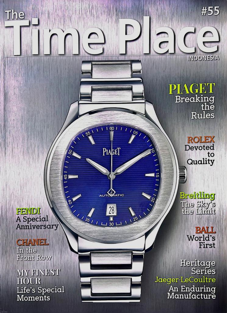
Title: The Time Place Indonesia

The Time Place is a magazine that shows wrist watches that mainly look expensive and luxurius.
In this magazine, you can expect some expensive brands such as Rolex, Gucci, Tissot, etc


Media Language
The cover magazine of The Time Place looks simple. The musthead is bolded but it does not uses capital letters which creates relaxation, while the subhead is using full capital letters but is made in a smaller size than the subhead. This highlights the main topic of this magazine. The sub-topics are shown many on left and right with the name of the brand highlighted to tell the audience that they're not only talking about normal wrist watches.

Representation
The watch in the cover is represented well and clean so it tells people that this magazine is not talking about some cheap watches but clean and expensive brand watches. The colour of the analog background is blue, which means its mainly for boys since it uses the colour that boys typically like. 

Audience:
The target audience is mainly males but females can be possible since watches counts as fashion. The male audiences are around 16 - 40 because men usually wear nice outfits and an expensive watch to look more proffesional. People who love watches or collect watches can also be targeted because in this magazine, it may have a chance of showing an old expensive watch that collectors are interested in. 

Industry
The Time Place has its own website showing lots and lots of old collectable watches. From their website, it can help younger audience to look for a watch that suit them. The Time Place has their own industry. It is a Rolex shop in South Jakarta called The Time Place Mall.


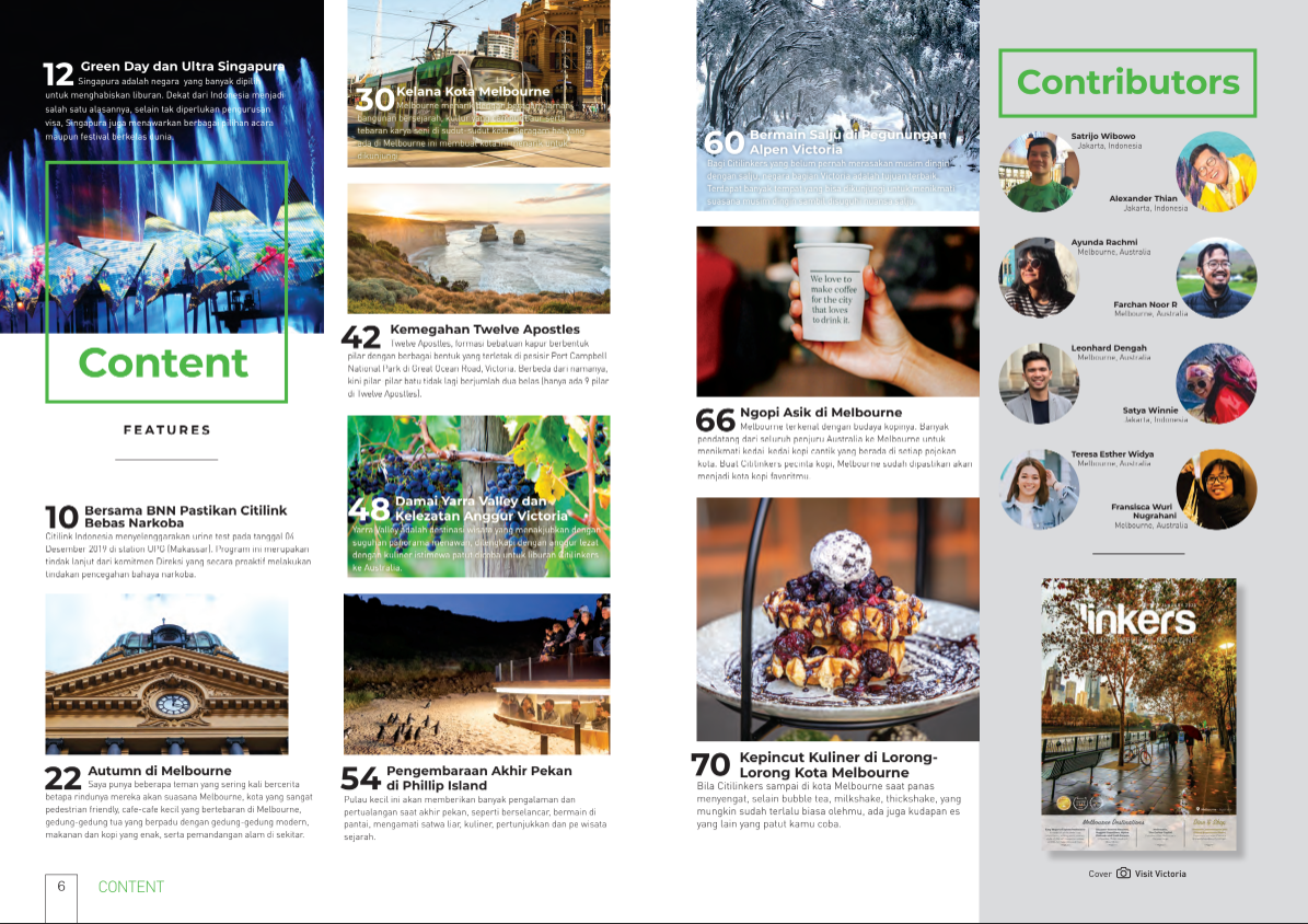
The way they put a calming picture in the background really got me. It's really relaxing to look at and its really simplistic. However the subheading is quite hard to see and needs to pay close attention to be able to see it clearly. The content images is quite unorganized, its quite difficult for me to focus on one thing because there are different types of pictures in the same page. Also the white spaces can be reduced because it really bothers me how there are a lot of white spaces.


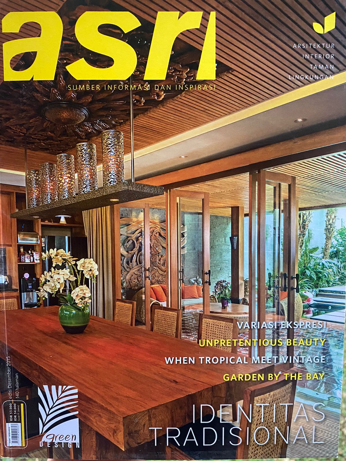
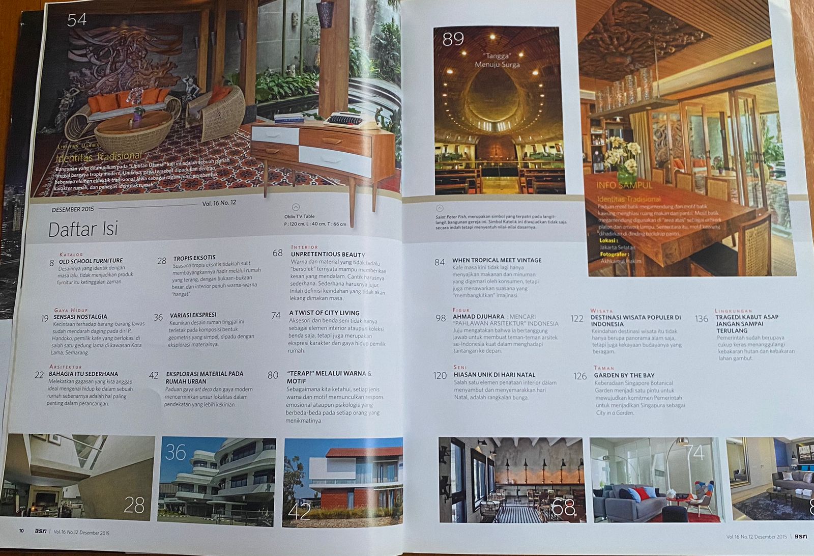
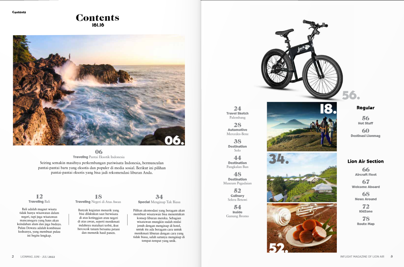
This magazine cover is really nice, I like the way they use classic or old furnitures as the main cover. It really tells me that this magazine will be talking about furnitures and interior house design. The contents here is also very simple, not too complicated and very well organized. It is easier for me to read so I think I will be using this kind of content page in my magazine so that people can read it easily


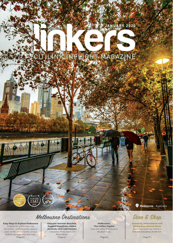
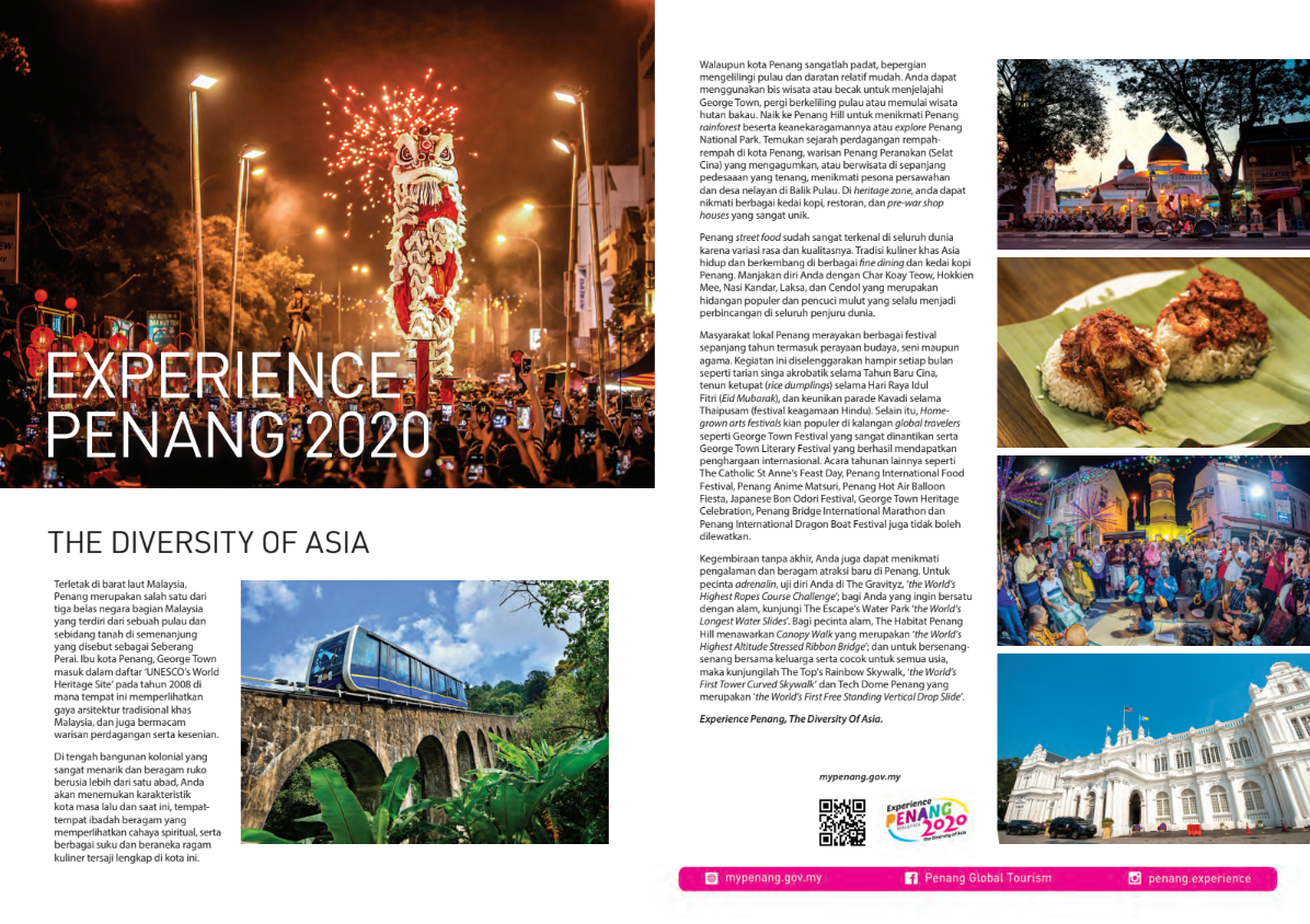
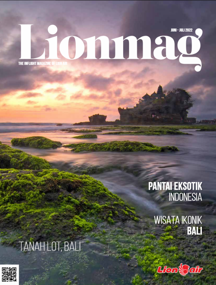
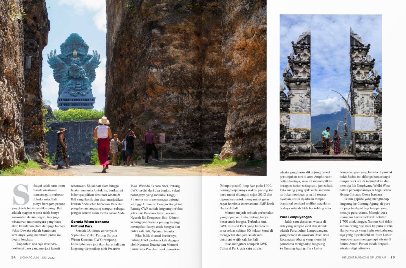
This magazine cover is really calming and mesmerizing. It uses nature as the cover of the magazine and it really suits with the company since it is trying to tell people more about tourist attractions. The content in this page is really simple, not too complicated. It only shows images of places in Bali and shows some information about it. On the double page spread also shows images and information, really simple but, pernsonally, I think its too simple. I think I'll be making my fron cover to be similar as this one. 


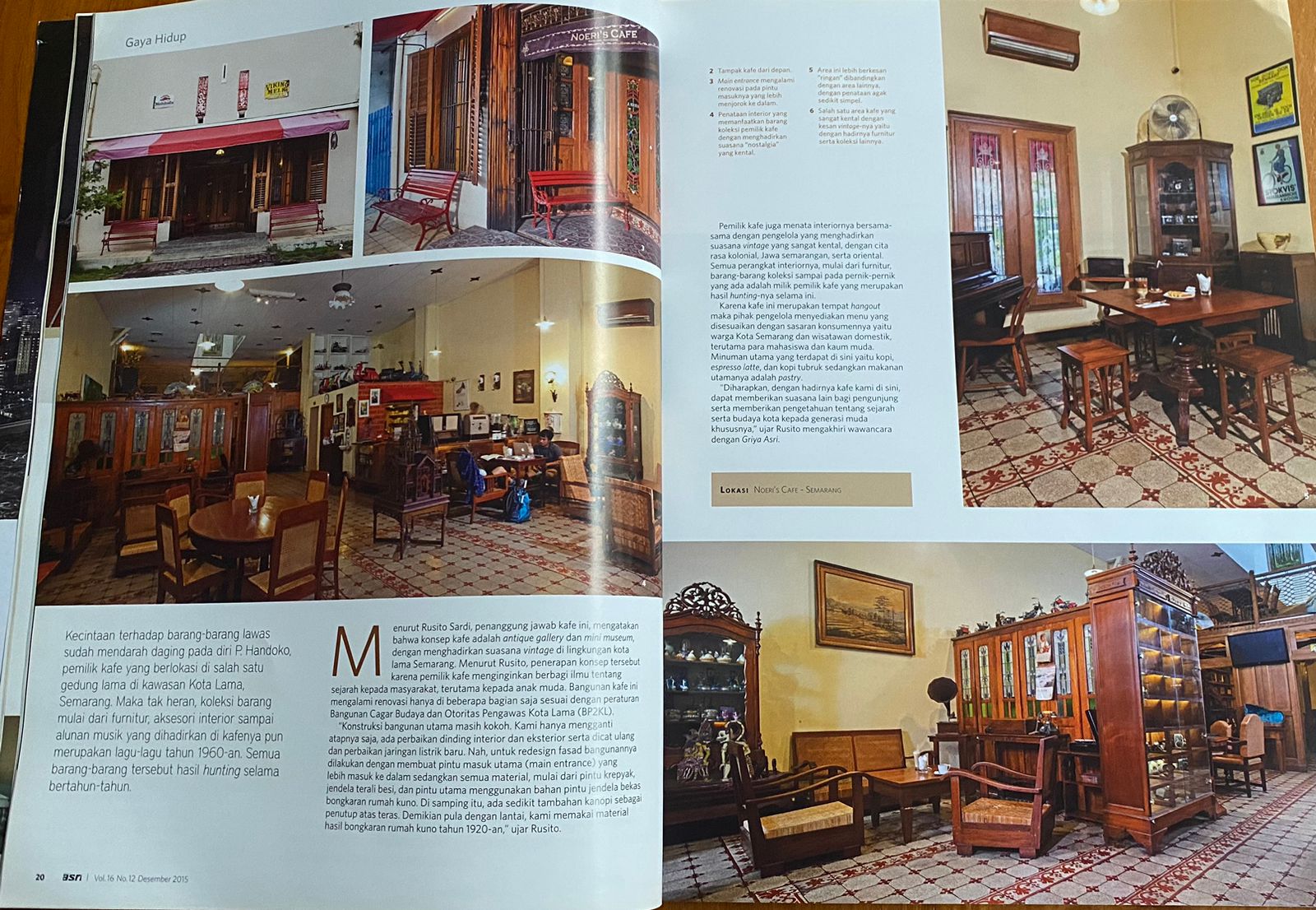
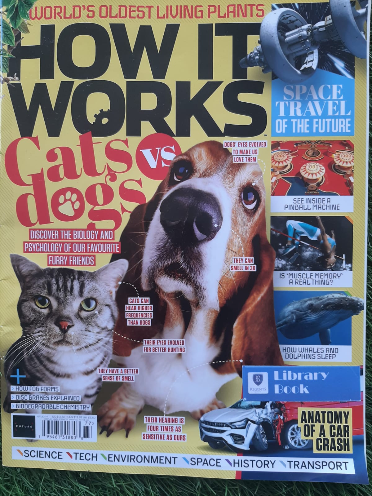
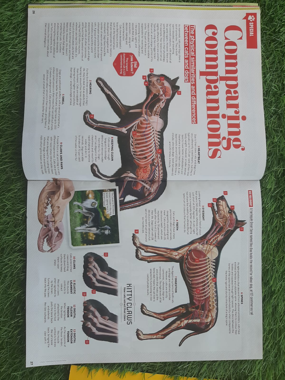
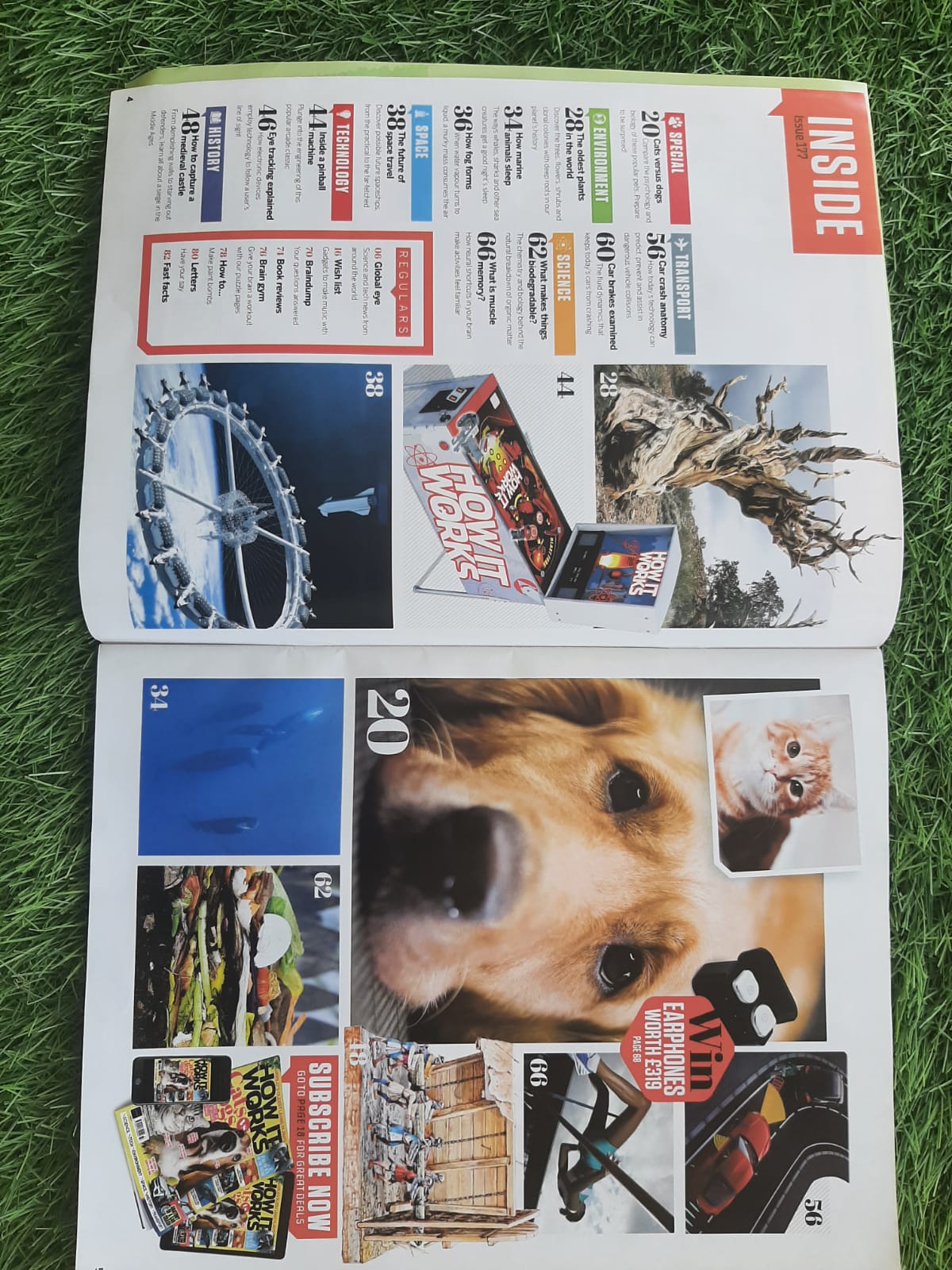
The front cover looks really interesting and I really like how they put the images of the cats and dogs together. One thing that I dislike is the advertisements which I think there are too much on the cover. The content on the double page spread is really interesting too because they put images that really caught my eyes and the information is not too simple, not too complicated. The table of content page is quite messy. I think ill be making my double page spread similar to this one. 

Here is a link to my Double Page Spread: Research + Development: w

Final Prouct: Final Video

  Here is our group’s final result on the music video